
Email: emanuelealbertocirello.98@gmail.com
Total Article : 76
About Me:I am a Year 13 student which aspires to be an architect. I am interested in anything I don't yet know, and I mostly write about art, politics , Italian culture and inspirational people, although I will try to write for as many categories possible, just to test myself and get to know more things.
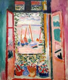
“The Open Window” is an oil painting by Henri Matisse made in the summer of 1905. It is a perfect example of the new art current which inspired French Art at the beginning of the century known as Fauvism. It represents the view from the window of the hotel’s room in Collioure in which the artist stayed.
It is a small painting with sizes 55.3 x 46 cm but it contains explosive and bright colours. Matisse has portrayed the scene in an inviting and light-filled way and with a large variety of tones and colours used to paint the boats floating on the calm sea and the sky during the sunset. The use of such unnatural colours and the presence of revolutionary minimalist strokes represent the key features of the “art of the beasts” and provoked agitation within the critics.
The colours of the painting are the main characteristic as the artist has given importance to the intensity and substance of the colours and with the use of different tones and shades it is able to create a three dimensional feeling of the painting as despite the lack of garish details is still able to give a sense of space and depth. The focus on colours is also visible as the artist has used a lot of contrasts due by the layering of complementary and primary colours. This is evident with the contraposition of a bright green used to depict the wall on the left of the window and a very bright and intense purple used for the wall on the right.
The composition is cropped as there isn’t a view of the rest of the wall or the space below the window. This helps to create a close up look to the view outside the window suggesting the intimacy between the artist and the habitat outside. This is because the focus is almost completely given to the view outside the window. The view, which is embellished by the presence of flowers sitting on the windowsill, and creepers climbing on the railing, is located at the centre of the composition. Despite the lack of a line of symmetry and any type of logic or geometric order, Matisse has been able to draw the attention of the viewer’s eye through the use of bright colours, almost fluorescent, which were used to portray the calm sea with its floating blue boats, and the sky tinted with the colours of the sunset. The calm sea at the horizon is painted with unreal tones of pink, sky blue and violet whereas the boat, painted with tones of indigo, orange and green, seem to move along with the light breeze. “The Open Window” is also a painting in a painting, as the sea and the creepers reflect on the shutters of the window creating different perspectives for the scene portrayed.
The colours are very warm and bright, and they add an energetic vibrant atmosphere, which add at the same time a feeling of pleasant peace. These colours are used against the typical art conventions, as some of the colours used (especially for the sea) are totally unrealistic but they give a new harmonious dimension making the painting even more interesting. The use of such colours is strictly related to the artist intention to convey emotions through the personal and intimate representation of the nature outside. The vibrant and spry emotions are also strengthened by the use of different brush strokes. As visible, the inside of the room is painted in a flat way, whereas for the outside, the immediate and thick brush strokes seem to suggest how the view outside of the window is vibrant and pulsing.
I really like the painting in every aspect. I find the mix of colours, contrasts and tones very fascinating, but what I find most intriguing the luminosity of the colours used. I really like the way that the sky reflects onto the surface of the water, and how the boats seem to float on the water so gently. I really like the mixture of complimentary colours such as purple and orange used to paint the sea, and the violet and indigo tones used to portray the sky. I also find interesting the way that the artist has given a different dimension to the elements outside of the window by using brush strokes with varying intensity and thickness. But more than else, I like the unreal vision that the artist has given of the scene outside of his window. It is unique and it is personal to the artist as the painting is characterised mainly by Matisse’s intimate and pulsing perception of the environment outside. I have chosen to reproduce this piece because it is different from any other, and so it is a revolutionary piece of art, which has opened the window to the art of the 20th century showing the possibility of using new and unconventional approaches to figurative art.
The habitat represented in this painting is vibrant and colourful, and is peculiar because it is portrayed in a very personal way. This interests me because I can represent my habitat in a personal way basing on my perception of the habitat itself, and therefore convey emotions and feelings through the use of adequate colours and tones in relation to those emotions.
Image credits:https://www.google.co.uk/imgres?imgurl=https://upload.wikimedia.org/wikipedia/en/e/e4/Open_Window,_Collioure.JPG&imgrefurl=https://en.wikipedia.org/wiki/File:Open_Window,_Collioure.JPG&h=1567&w=1331&tbnid=_di77jhLqJvX5M:&tbnh=186&tbnw=157&docid=bvL5oYQGZG12OM&itg=1&usg=__k7Ph038LK2fSYtwM9FWGHU6GSlg=

0 Comment:
Be the first one to comment on this article.