
Email: emanuelealbertocirello.98@gmail.com
Total Article : 76
About Me:I am a Year 13 student which aspires to be an architect. I am interested in anything I don't yet know, and I mostly write about art, politics , Italian culture and inspirational people, although I will try to write for as many categories possible, just to test myself and get to know more things.
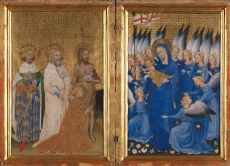
“The Wilton Diptych” is a medieval (circa 1395-1399) diptych which consists of two equally sized panels of 37*55 cm made by an unknown artist. The artwork is made on oak with the use of tempera and is showing two different scenes which are different from each other.
The composition of both scenes is quite centralised and organised. In the left inner panel King Richard II is presented by Saints John the Baptist, Edmund the Martyr and Edward the Confessor each carrying an attribute tradional to the nativity scene. In the right panel, Virgin Mary is holding Jesus Christ in her arms surrounded by eleven angels, immersed in a golden background with floral decorations. The composition is not strictly symmetrical, but however the focus is directed towards a central figure in the left scene, represented in full white clothes, whereas the focus of the right scene is directed towards the Virgin Mary and Jesus. The right scene composition is meant to suggest movement and dynamism but it fails at doing so as the technique used makes the angelic figures look static and quite lifeless. The same goes with the figures in the left scene which do not resemble fully the fluidity of the figure’s movement.
The colours used do not try to express emotions as the subdued and plain tones give to the artwork more of a spiritual atmosphere rather than a real and dynamic one. The static of both scenes is mainly due to the use of very similar tones of colour. In the left scene for example, there are mostly warm tones used all around, from the ochre yellow of the background to the yellow and brown of the figure's dresses, whereas the scene on the right is dominated by blue tones, which make the painting look lifeless and extremely plain with no particular figure attracting the focus of the viewer. The use of the golden backround is typical of Gothic art, and can be observed across numerous works of religious inspiration where the two-dimensional portrayal of the figures and the lifelessness of colour creates sometimes dull compositions.
The quality of the colours can have been also affected by the fact that a medium such as egg tempera may have lost its full colour with the advance of time and therefore the tones of the scenes have been faded and changed based on the conservation of the art piece. The technique uses quick drying colored pigments with a water soluble binder, ofter egg yolk; tempera paintings are long lasting but as seen in the Wilton Diptych this technique and the medium used can lose some of the pigment's tone.
The artwork was conceived and used to show the closeness of King Richards to the Holy as Jesus Christ reaches towards him in benediction and gets closer to the pennant that bears the Cross of St. George, the symbol of England, to show that Richard's reign was divine. Given this, the extensive use of cobalt and ochre symbolises power and wealth, as well as the vermillion, another expensive pigment, used for the King's robe.
Image credits:https://www.nationalgallery.org.uk/paintings/english-or-french-the-wilton-diptych

0 Comment:
Be the first one to comment on this article.