
The works of Juan Francisco Casas spark an interest in portraits which seemingly appear photographic but are actually in fact, remarkable biro drawings. Born on 21st September 1976, after which Casas embarked on his artistic journey into a region of photorealistic masterpieces. It is not just the skill which attracts me to his work, there is a meaning behind why he has arranged his subjects in a certain way, and this goes beyond the artist showing his technique. Often with hyperrealist work, it offers aesthetics and visual happiness, but with accurate depictions frequently the focus is on the artist and their skill rather than what the subject is portraying. Conclusively, there is a lot more to be explored than just an ordinary dexterous portrait.
There are quite a few selections of themes displayed in his portraiture, many of which however, are of a sexual nature. The enticing images can appeal to a certain target audience, but for me, what I like is the freedom of expression, and the depicted self-confidence.
If the work did not already seem amazing enough, it gets even better when you see the size of it. With drawings measuring up to 10 feet high, the result leaves viewers astounded. Taking two weeks to complete it is important for Casas to be completely focused, as with ballpoint pens, there is very little room for error. The size of his work emphasises what he wishes to show.
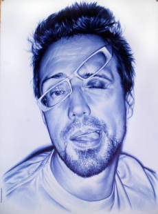
As I began to look more closely, I began to realise that not all of Casas’ work is as smooth as I originally thought, still highly detailed and complex however. In some areas you can see Casas’ cross hatching technique whilst in other areas the pen is so smooth that there are no visible lines. This sort of technique needs a steady hand and patience. Considering using such a grand scale, Casas manages to use cross hatching so effectively that it is inspiring to me. The accuracy being crucial, working so realistically, the observer’s eye will be drawn towards the slightest of disproportion. One of his methods to create such a realistic effect is using tone, highlights specifically. Casas mainly uses white space with a few areas with very light blue to show lighter/ reflected areas of the face. Additionally, he uses very dark shadows, this combined with the highlights creates the effect of a photographic image being taken of the subject. This photo being high in contrast with a varied use of exposure. To create darker areas, it is necessary to build layers. Starting lightly then gradually getting darker grasps the smooth effect. The dark shadows help to shape the face whilst the highlights help to make the work less flat.
Despite the portrait being blue, it really looks like a photograph. Compared to a smaller fraction of his work where he uses black biro, the blue looks more effective. I think this is perhaps because the use of blue is more evocative in emotions whilst black ball point pen is colder and doesn’t entice the viewer as much. According to graphic tradition, blue is usually associated with writing and the world of education, this helps to achieve an addressed message to the observer. Being able to convey a message through an image is highly impactful, being attracted to a piece due to feelings towards it is powerful. It makes me wonder, how would a similar portrait in red, green or even pink make the viewer feel? The style reminds me of social media, the kind of images people post on perhaps Facebook or Instagram.
Image Credits:
http://www.art-spire.com/en/traditional-drawing/sexy-realistic-drawings-by-juan-francisco-casas/

0 Comment:
Be the first one to comment on this article.